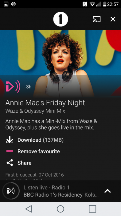
What I loved most about the old BBC iPlayer Radio app was the GUI. The design of the interface was straightforward, easy-to-understand and worked well. Whether you were sat still or going for a jog – you had a natural and simple interface that did exactly what you wanted it to.
But a well-designed app can sometimes be hard to come by. Back in the day, Windows Phone brought us an interface which was the same throughout – in the apps and out of the apps. However, with Android you can find that some apps are totally different to the usual phone interface and, if the app has been done by a single developer who doesn’t necessarily have the graphical skills, the whole thing can look messy, distracting, confusing and hard to use. A great app it may be, but if you’re faced with a mass of toggles, switches and drop-downs, it can be really hard to use.
So, based on what we’ve experienced ourselves here at Coolsmartphone, here’s our thoughts on what can make an app better.
Intuitive Interface
This is hands-down the most common thing that users want in their mobile apps. When someone uses an app, they’re trying to achieve a specific objective. Whether it’s navigating themselves to a friend’s house, getting an update on a flight arrival time, or learning how to play a mobile game, mobile app users want to complete this objective as efficiently as possible. This means the user interface should be intuitive, in that it should not be difficult to navigate for new users and must be designed with user priorities in mind.
Detailed Instructions
While making it a mission to make an app as user-friendly as possible is important, I won’t pretend that it’s feasible to design a UI that requires no instructions. Depending on the depth of the app’s range of functionality, detailed instructions may be necessary, no matter how intuitive the UI happens to be in practice. This is where a detailed and thorough technical documentation of the app’s functions comes into play. Such documentation serves as the groundwork for useful instructions made available to users when needed.
Battery Friendly
This one should be common sense to most people, assuming they’re smartphone users. Phone app designers should consider the amount of power the software will draw from mobile devices when making their design choices. Many users will use maintenance software to identify the apps that consume the most battery life and will mark your app for deletion if it ranks high on the list. In short, energy demands need to be weighed against the user benefit.
Add Humour
So many apps are designed so that they are devoid of any trace of humanity. These sterile virtual environments could stand to lighten up a little. Incorporating some humour into an app is a great way to make users feel more at ease when putting it to use. For example, text overlays could include a clever pun. It doesn’t have to be brilliant comedy, just a splash of silliness to make the UI more relatable to the humans interacting with them.
Avoid Creepiness
Apps which reach out to the user when not in use, or involve similar gimmicks to essentially guilt users into using the app, is just plain creepy. Constant notifications about coins, or about “messages” that you have can be intrusive, annoying and just plain strange behaviour. App designers should prevent these actions from making the final cut for release. It’s not only one of the easiest ways to make an app come off as a stalker, but it’s also almost guaranteed to result in the app being uninstalled from the mobile device.
Mobile apps play a significant role in the lives of billions of people across the planet. Given that level of influence, app makers have a responsibility to make their products function to the best of their ability.


